
Well Happy Easter everyone! I hope you’ve all had a nice weekend and got to spend at least a little bit of time with your friends and family this weekend. Whatever the number, it was surely better than last year when we were all locked down and no one was doing anything. It is so nice to finally be seeing what will hopefully be the light at the end of the tunnel.
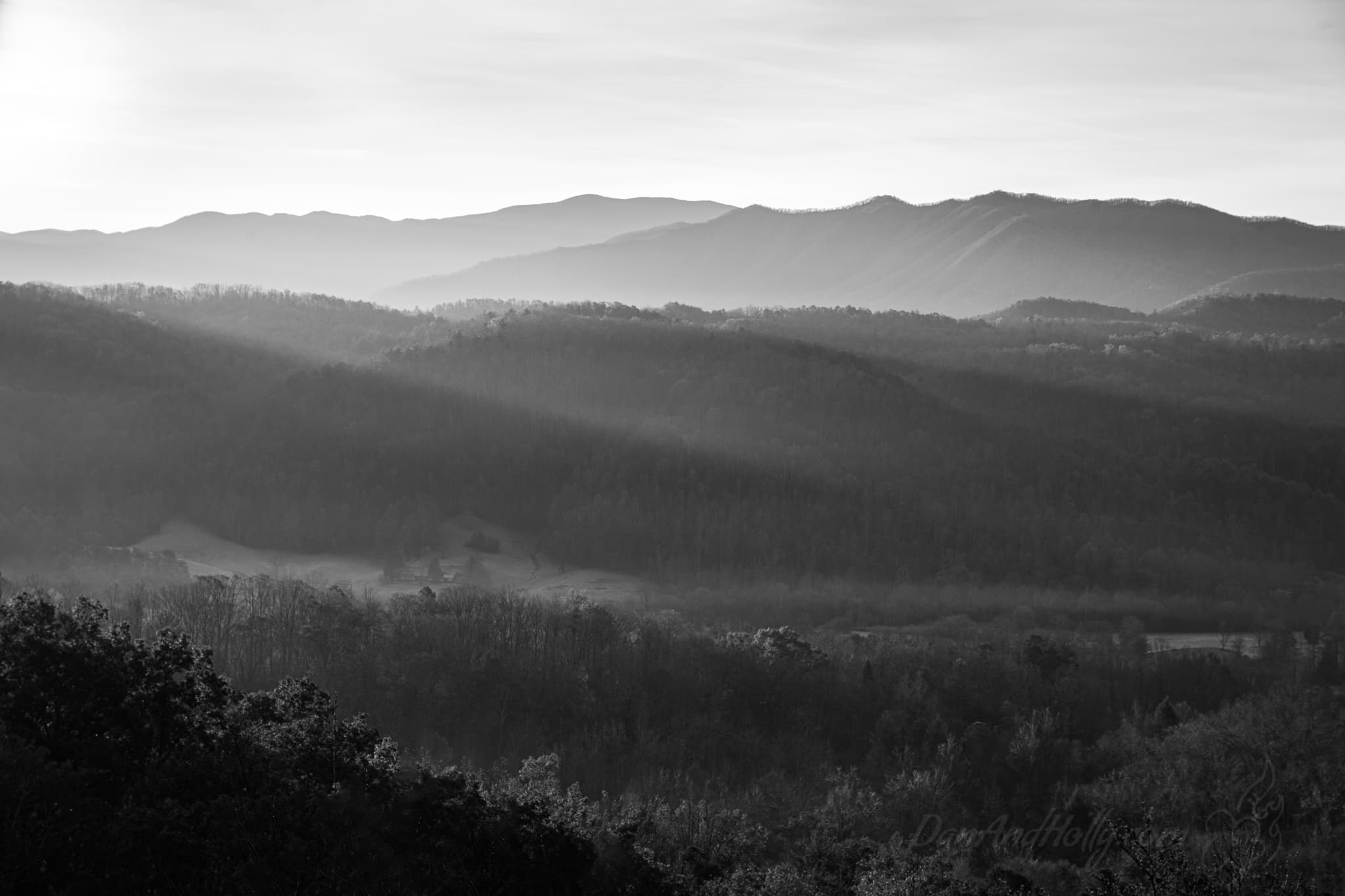
I think this week’s image makes a point.
Over the last couple of weeks I’ve mentioned that I did what I called a color sabbatical, basically only shooting black and white for the entire winter season. I’ve mentioned *that* I did it, and ultimately *why* I did it (to get better at black and white), but I’ve never discussed why I even like black and white to begin with. I know for some, you see a black and white image and think “why is this is black and white”, so allow me to explain the artistic choice of black and white.
When photography got its start, there was no choice; black and white was all there was. But even after the invention of color processing, some artists still chose black and white as their medium. The great Ansel Adams, who shot in both color and black and white, conceded that he couldn’t get as creative with color as he could black and white, and therein lies one of the reasons I like it. With black and white, you as the artist are dealing only with tones (lightness and darkness). It’s a bit abstract already, because we humans see in color, so when you see a black and white image, our eye is not as quick to pick up on creatively edited images. Conversely in a color image, we all know what color the sky is supposed to be and what color trees are, so any oddity there and the brain immediately picks up on it. You may look at a poorly done black and white image and think, oh that looks strange – but a poorly done color image and people will immediately say “oh that’s fake”.
Beyond the extra head room for editing though, I believe you can achieve a certain moodiness from black and white images that can often times be missing from color images. In fact, if you look at a lot of the popular color images today that people would say are moody, they’re often times desaturated. Now, this is of course not to say that you can’t capture mood with complete, or even saturated colors, I would suggest it’s just easier to pull of with black and white. Taken together, I personally think that black and white images have the power to really stand out. In a world of habitual-scrolling where we see hundreds of images per day, a solid black and white image has the ability to really jump off the page at people – attention grabbing – while a well done image is always attention holding.
So, what does all that have to do with this week’s image. Well, first of all this is never an image you would take in color. This particular morning the sky was fairly cloudy with high level clouds and the sky just got REALLY bright once the sun came up. Because of these clouds, the sky wasn’t an interesting color (I generally hate white skies in a color image). As the sun rays ran across the valley, they ended up looking a bit stark, leaving the scene very contrasty. In black and white, however, this can all be leveraged for mood. First note the progression of dark to light from the bottom of the image to the top. That is essentially using the heavy contrast to draw the viewers eyes to the light rays, and keep them there. With the light sky, the eyes immediately notice they’re traveling “out of bounds” and with the extra dark mountains in the foreground, the eyes are again reminded of the boundary. In the center is where all the action is. Light is interacting with the tops of the hills, and there is good mid-tone contrast to bring all that home. As a color image, there ended up being these odd shades of blues and greens after editing it this way, and the sky looked completely weird. In black and white though, it all wraps up together nicely.
More next week!
–Dan Thompson
